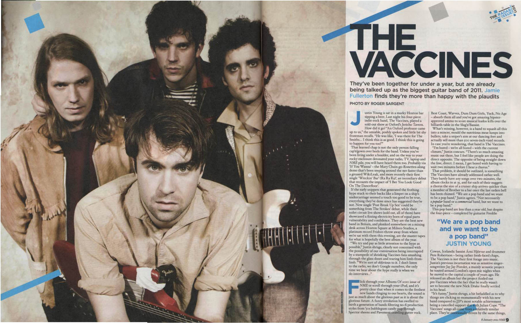
This double page spread is about the band called 'The Vaccines'. As we can see, the picture of the band takes up just under three quarters of both pages. This is so we know who the article is about and also because they do not have much information on the band to go across two pages so they cram it onto one page and put it in really small font to make it seem like there is a lot of information.
The colour scheme to this double page spread is rather interesting as there is use of dark colours and light colours. The overall colour use on this though is neutral colours, like the white and light blue. These contrast with the colours in the picture nicely and attract the eye to the picture rather then the information. Three of the band members are wearing quite dark coloured clothes and the one member at the front is wearing a lightly coloured shirt, perhaps this is to signify importance of each band member.
The title is in block capitals and in black font so it stands out from its background to attract the audiences eye to it so we know who the picture is about. The language and content of the article is highly relative and refers to things in a sense of humour that your average teenager wouldn't understand. This language is more for a sophisticated and educated person who would be classed in todays society as a 'seen kid' or an 'emo'. This is because it refers to things that not many people know alot about, things that also in todays society are classed as 'underground' and not 'mainstream'.
No comments:
Post a Comment